
5 Fundamental Characteristics of Good Logo Design
When we start a logo design project, our clients usually have preferences about what they want to see in their logo. Maybe it’s a specific colour they want to use, or a symbol that encompasses the brand they want to represent.
Those preferences are important - if you hate your logo, you’re probably not going to want to use it regularly.
However, the most successful logos aren’t that way just because they're technically great. Best-in-class branding only belongs to best-in-class businesses. A well-designed logo is useless if it doesn’t represent an equally great business. Do you have a set of core values, guiding principles, or a mission statement for your business? If you haven’t done any business strategy exercises before, your answer might be no.
The good news? You understand what your customers care about, and the reasons they use your company over their competitors. Use this information to work out what makes you special, and make sure that knowledge is driving your decision-making process.
You’ve figured out what your business stands for, and the value your business provides your customers. Now, to design a successful logo, we need to follow some fundamental logo design conventions.
Thanks to the work of revolutionary designers like Paul Rand, Alan Fletcher, and others, these five principles or variations on them, form the foundations of modern logo design.
Simple
If you’ve spent any time working with a designer, you’ve probably heard this one before: simplicity. It’s so important to us that it’s part of the my core design principles. Simplicity is critical for a good logo because it directly affects all four of the other principles.
We’ll just go ahead and say it: people are less likely to remember a complicated logo. It’s harder to reproduce a complicated logo in different mediums, and the trendy flourishes that accompany many busy logos usually look out of date a year or two down the road.
Memorable
The primary reason for having a logo is to make your business memorable in the eyes of your clients. The most memorable logos are the ones with the simplest, most distinct shapes. In addition to using shapes that are as simple as possible, colour also plays a huge role in memorability. Few people could draw the Coca Cola logo by hand, but everyone recognizes its distinctive bright red colour.
Appropriate
No two businesses are the same, and the same should also be true of logos. The logo should be right for its audience, as their preferences are far more important than anyone else’s. The colours, shapes, and typography used in a logo play a huge role in conveying the correct tone for the audience.
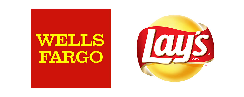
In the above image, Wells Fargo and Lay’s use similar colour palettes despite having a very different target audience. Through the use of different shapes and typography each logo is works well in their respective industries.
Versatile
Branding encompasses much more than just a logo - there is typography, imagery and colours that all form a part of the visual identity of a business. However, the logo is likely the only piece of branding that will appear on *everything*. Whether it’s a business card, Twitter profile, letterhead, billboard or a branded USB stick - chances are, the logo will be on all of them.
That means the logo needs to:
- work in small sizes, huge sizes, and everything in-between.
- be straightforward enough to embroider and stick on a t-shirt.
- work in colour as well as black and white.
- be recognizable from a distance, but maintain its clarity upon closer inspection.
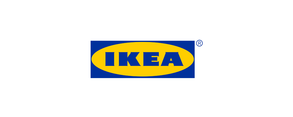
Ikea’s distinctive yellow and blue logo is designed to work well whether it’s stamped on the bottom of a wine glass or painted on the side of a building.
Timeless
Many of the world’s most valuable brands have something in common: they haven’t changed much over the years. If you design a logo that follows all the hottest new trends, chances are it will look out of date pretty quickly. How will it look in 10 or 20 years? The only way to achieve something that truly embodies the values of the organization. Timeless logos stand out from the crowd and are as visually pleasing in a few decades as they are today.
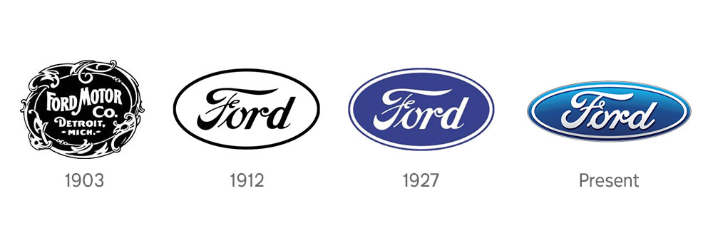
New cars today don’t bear much resemblance to those of a century ago, but the Ford logo of today is essentially the same as its 1912 counterpart.
When you decide to start a logo design project, remember these five principles to ensure you’re thinking about the process critically. Our preferences as business owners are certainly important, but a successful logo requires us to think about our how we’ll use the logo and what our audience is looking for.